When trying to figure out your testing or monitoring solution for a WebRTC application, one of the most important parts (and often overlooked) is the dashboard.
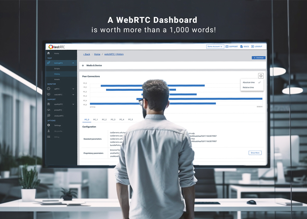
I’ve seen this time and again in projects and services. Companies have to decide a build versus buy decision for their WebRTC testing or monitoring. With testing, they may look at what it takes to launch machines. With monitoring, they’ll be razor focused on how to collect WebRTC statistics. More often than not, the things that will get lost in all these requirements and technicalities is powerful visualization.
This article was written with WebRTC testing in mind, but it can also apply to monitoring to some extent (with the required modifications).
Surgery is successful, but the patient is dead
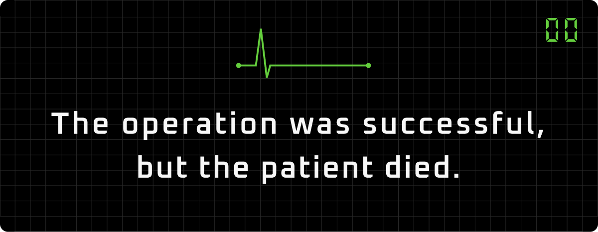
Oftentimes, this is what I feel from conversations I have with WebRTC application developers. They spend so much effort on their application itself, but then when it comes to observability and the ability to conduct tests properly – crickets! The app they build is great, but it just doesn’t fit the requirements they need when it comes to its WebRTC performance.
Usually, they don’t test, test only manually or have their own test automation rig that is half baked – just barely enough to do *something*, but not enough to be truly useful. Taking it to the next level is what is needed to save our metaphorical patient here.
The components of a rock solid WebRTC testing solution
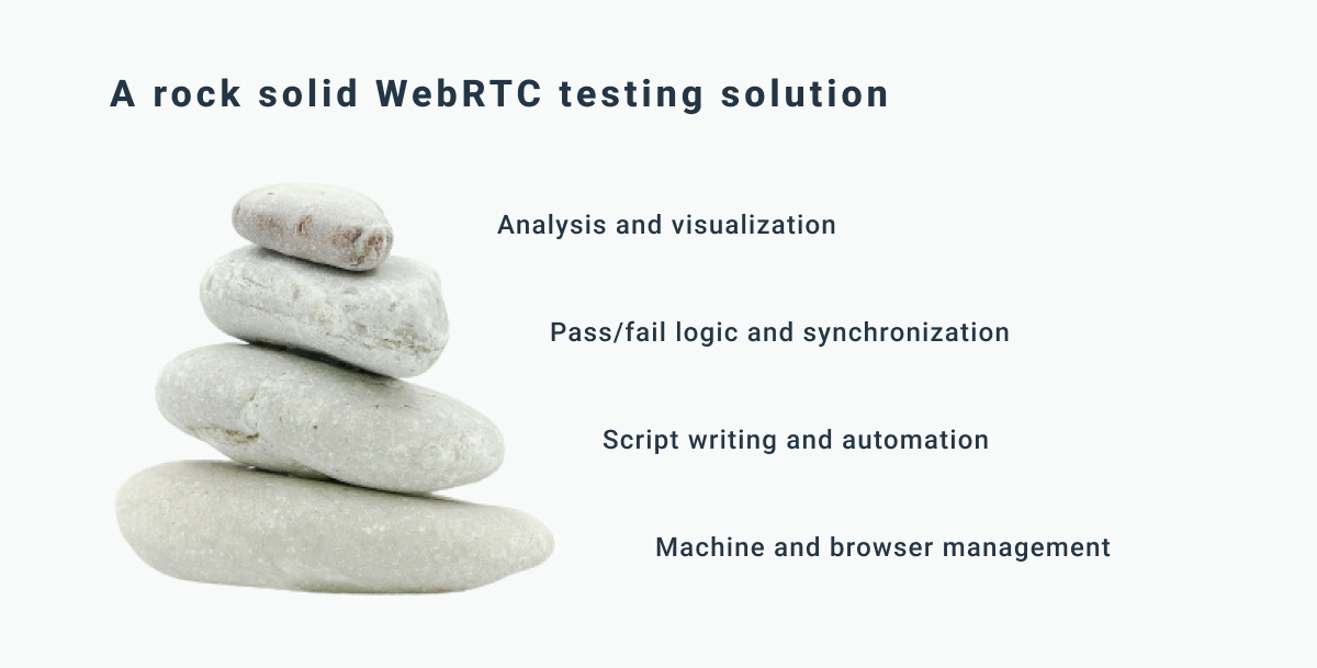
In my mind, there are 4 parts to conducting tests in WebRTC:
- Setting up the machines to use (and scaling them)
- Writing scripts to simulate users and automate browsers
- Figuring out alerts, assertions and synchronization
- Analyzing the results
The first two are rather “generic” in nature. WebRTC brings with it a lot of nuances and additional requirements, such as forcing stronger machines to be used due to media encoding and decoding.
Figuring out alerts, assertions and synchronization is highly relevant to WebRTC applications. The alerts and assertions need to be focused on WebRTC metrics and behavior. Synchronization is about being able to communicate across browsers/simulated users in the test with ease (this is critical when it comes to simple script writing of complex scenarios).
In this article, I’m going to dig deeper into analyzing the results generated.
3 levels of results analysis in WebRTC testing
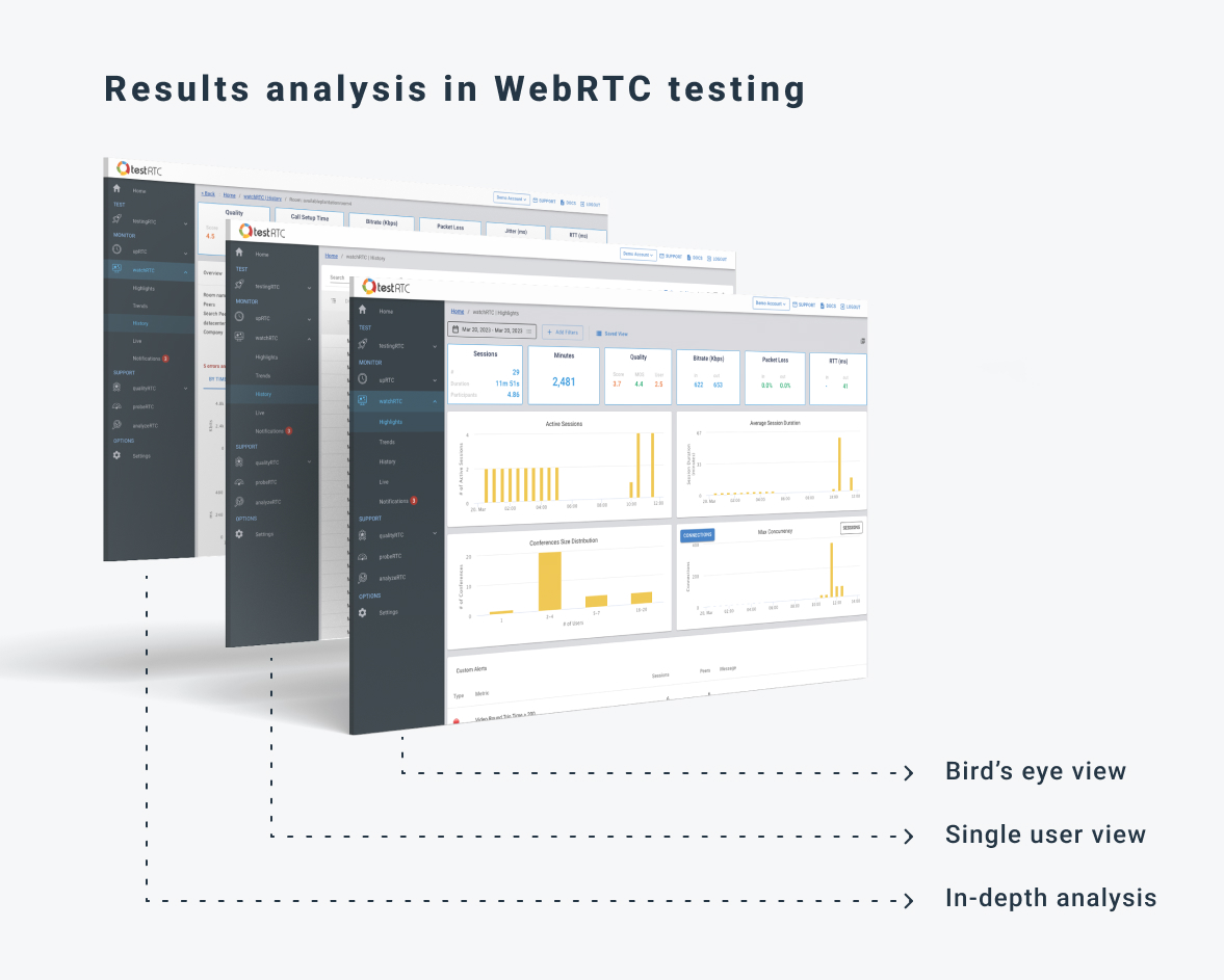
When looking at the result of a test scenario in WebRTC, we need to be able to look at it from different angles and views. On one hand, we need a really good bird’s eye view of everything, to answer the simple question of “what went on here?”. On the other hand, we are interested in drilling down to the minutiae details of a specific user at a specific point in time, looking at a single result out of hundreds of collected metrics.
For this purpose, I’ll suggest a kind of a layered approach here, where the tester slowly peels the onion when looking at a test result – from a bird’s eye test result view, to a single user view along with a drilldown to the whole shebang – as close as we can get to a beautified (and smart) webrtc-internals view.
Here are the things I found most useful in each of these layers.
WebRTC test results – a bird’s eye view
I like to view this part as “god mode”. You get everything in the same place.
There are two things such a view needs to be able to answer:
- Did we pass or fail?
- Where should I focus my drilldown research?
Passing or failing can be due to a number of things. It depends on the exact scenario you are trying to validate, but also on the actual ebb and flow of the WebRTC media itself.
Assume you have a WebRTC SFU you want to test at capacity. Setting up multiple sessions with 4 users each – when does it start to break at the seams?
- Is it at 80% CPU?
- Maybe at a given threshold of total network throughput?
- Would that breakage happen for the last users joining or would it get distributed and hurt everyone on that server the same way?
- How would you even approach looking at the results of such a thing?
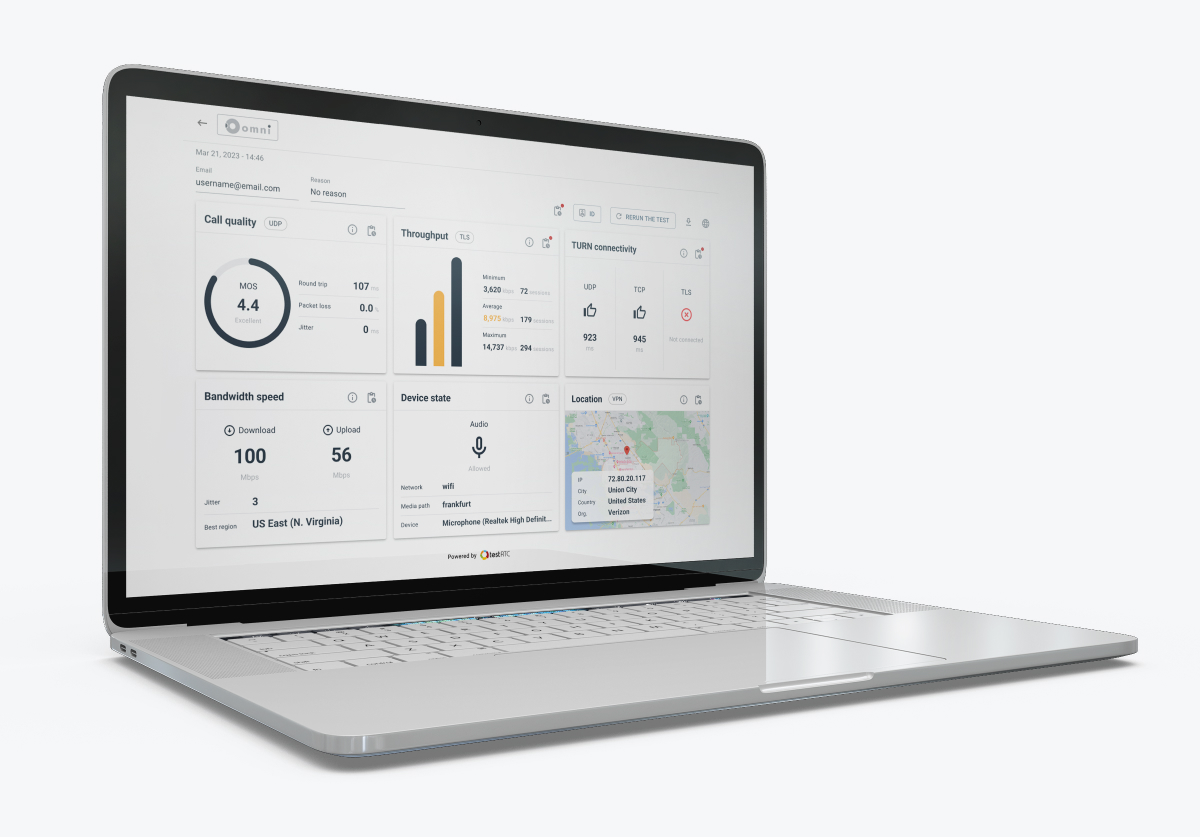
Here are some powerful visual guides we’ve introduced to our solution over the years to get you to the answers faster (remember those questions? 1. pass/fail and 2. where to focus)
Ribbon
The test results ribbon holds the averages for the most important quality metrics available. These give you immediate feedback as to what the results look like.
In there, besides having bitrate, packet loss, jitter and RTT (round trip time) spelled out and split by audio/video incoming/outgoing, we also have machine performance and quality scores.
My 4 favorite things about the ribbon?
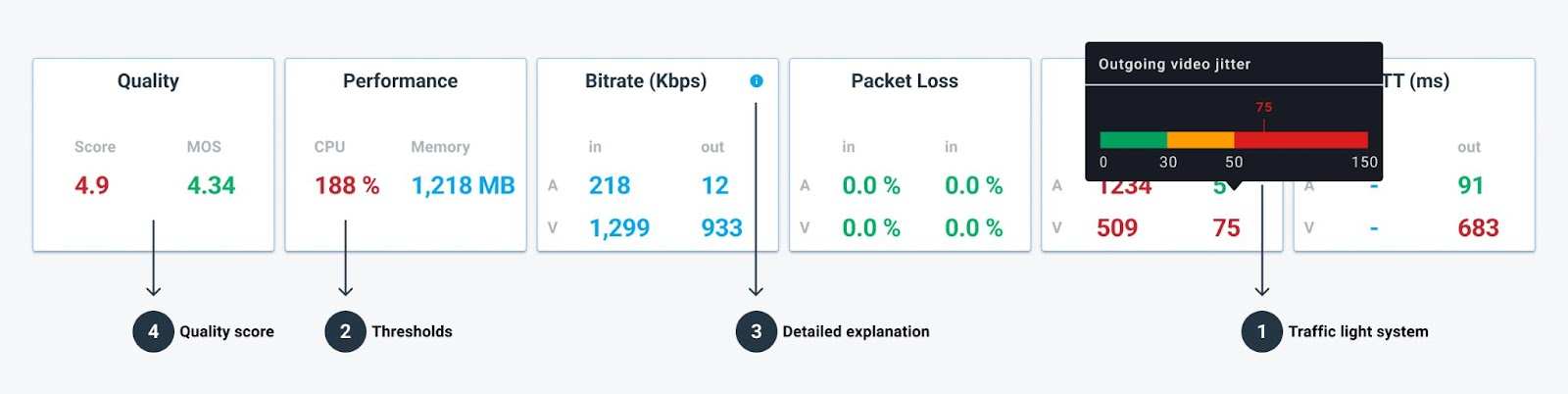
- Traffic light system, where bad values are colored orange and red.
- Thresholds that are configured and visualized right there in the tooltip on hover.
- Detailed explanation via direct links to the knowledge base, making it easier for you to understand what we measure and how.
- Our quality score, that gives insights into the media quality results in a single value and can be used to compare similar scenarios and their differences in quality.
First thing I do when opening a test results page is to look at the ribbon.
Aggregate charts
We added these charts a few years back. In the good ol’ days what we had was just a simplified version of the ribbon and the probes list (see below). Up until the first serious client we had who was interested in stress testing and sizing his media servers.
Their main ask? Having an understanding of where to look for next without opening multiple results of different probes/users after running each test. And the ability to download a CSV file and look at it in Excel or Google Sheet wasn’t a solution for their needs.
So we ended up investing quite a bit of thought and then time and effort in creating the aggregate charts functionality that has been with us ever since. What does it do?
It gives you the ability to understand the behavior of media flows in the test results, looking at them over time or per probe, and from every angle we could think of.
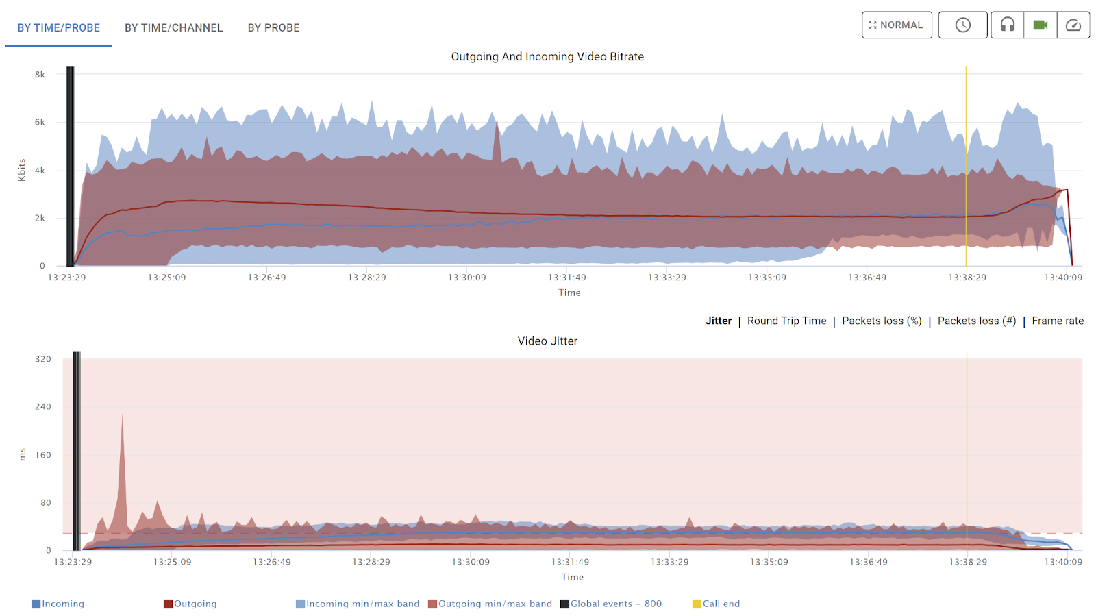
Things you can learn in a few seconds from these aggregate charts include:
- Understanding bitrate fluctuations across all browsers in the test;
- Catching potential artifacts such as high packet loss or jitter, along with an understanding how they occur; and
- Pinpointing bad actors among the browsers.
Probes list
For us, probes=users=browsers. A probe is the logic entity we use to run a single automated browser in these tests.
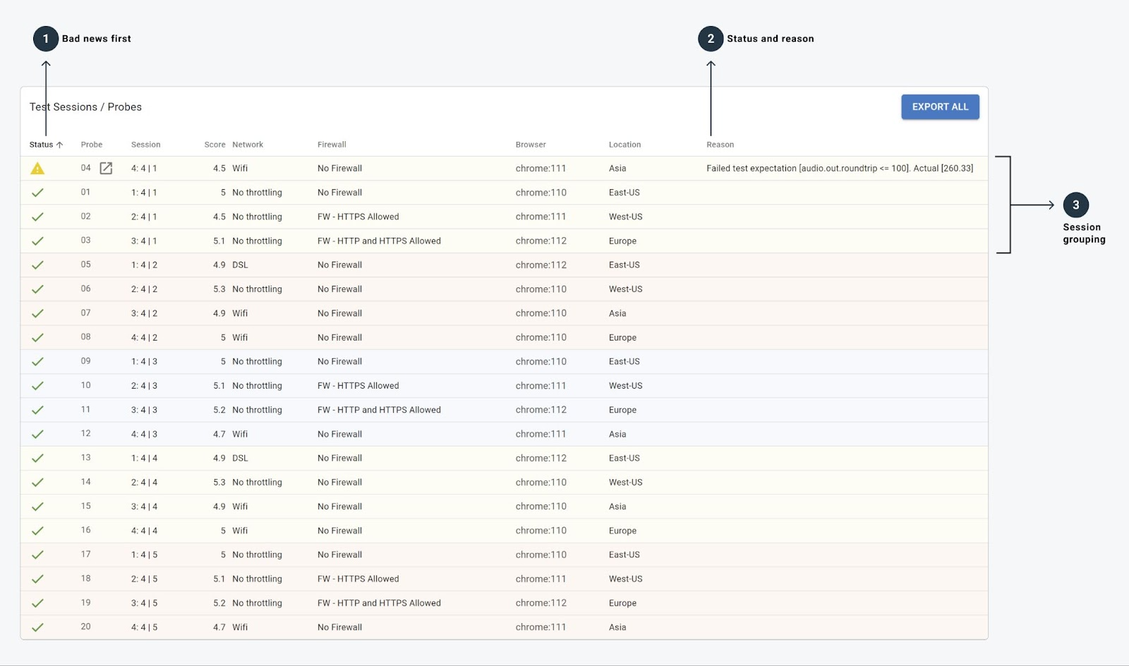
Having these listed and being able to click on any of them to drill down further is a mandatory step in any WebRTC testing tool.
To make things easier here, we’ve also added 3 important visual guides:
- Bad news first – The probes that fail or have warnings on them appear first in the list. This means there’s no need to search for them.
- The status and reason for each probe can easily be seen on each row.
- Session grouping is hinted by a change in color, so you can easily figure out how probes are split into sessions.
Like everything else, we try to ensure that you don’t need to stay on a page for a long time to figure out where to go next in your investigation of the results.
A single user angle in WebRTC testing
This is when we’re starting to “dig in” to what happened to a specific user in a WebRTC test. The “standard” we’ve been educated with is what Google has implemented in Chrome:
That’s about as much visualization as we’ve been given, and while it has a lot of stats in it, it is far from ideal for someone with a mission to find out as quickly as possible if and what went wrong.
Which led us to design our own take on what a single user view needs to look like for WebRTC test results:
Like the test level view, we’re trying to give insights here on what is important so you can reach decisions as quickly as possible. I also want to shed some light on the tweaks we’ve done over the years to get these problems to pop out of this page:
Ribbon
Same as we do on the test level, here too we have all the important averages of metrics calculated, displayed and highlighted using the traffic light system.
At a glance, you know what you’re up against.
Notifications
The notifications include everything from exceptions and errors in the browser console logs, through exceptions captured via rtcSetTestExpectations() and all the way through our own test results logic.
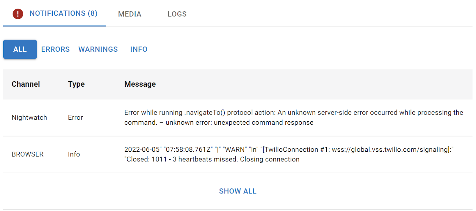
The point of it all is that if something went wrong, it will most likely appear here in text form for you.
Media
This is where we store the collected screenshots from the test.
Screenshots are taken when you call rtcScreenshot() or automatically when a test fails and we have an opportunity to take one (not always, but when we do, it is a huge advantage).
When I look at test results to figure out what went wrong, I always look at the screenshots taken. It gives me a feel of what happened in the scenario instead of what I think happened.
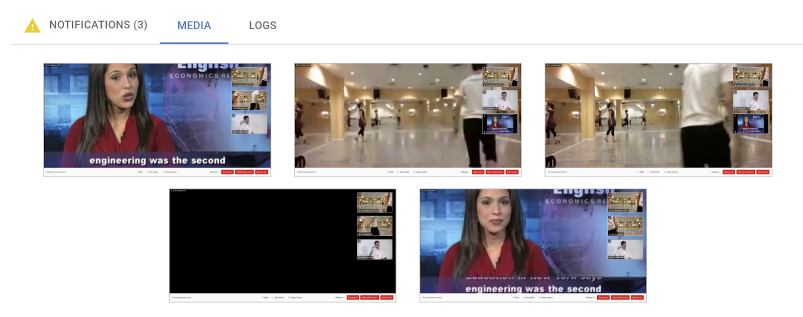
Where this really shines is when tests fail due to UI issues like being unable to click a button that isn’t there, failing to login on credentials, etc. – put simply, if the test “ran off the script” you’ll catch it here.
Channels
The channels section is where I go to understand what this session is about for this user.
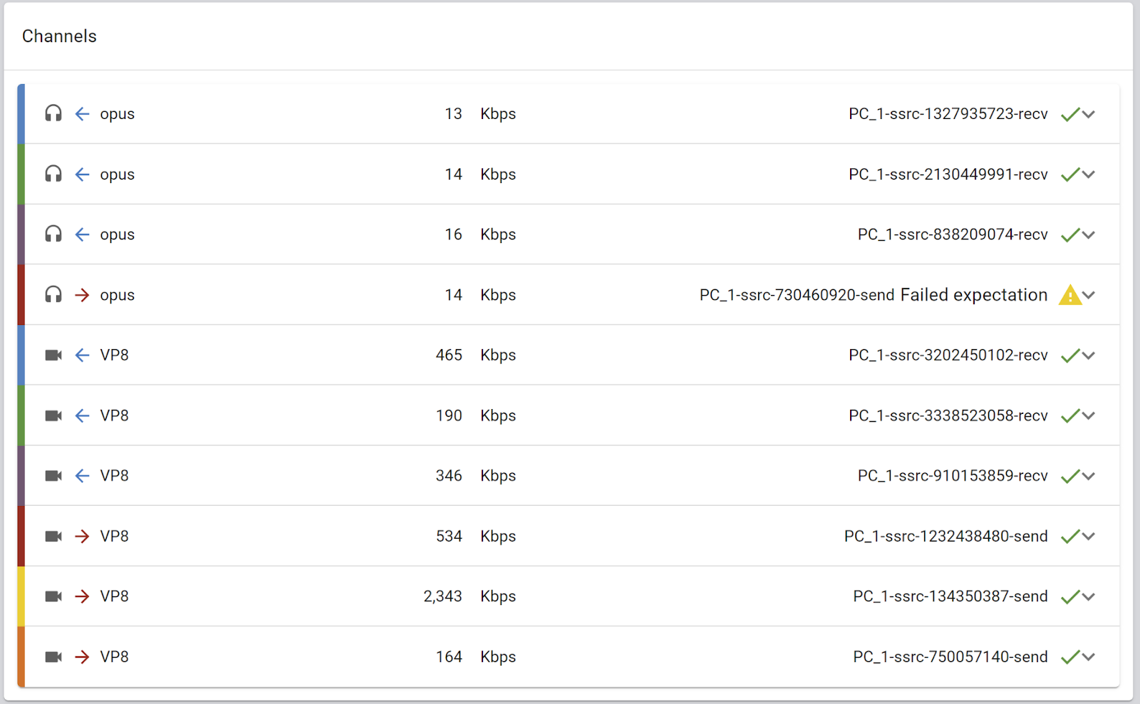
Just looking at it gives me an understanding of how many incoming and outgoing channels were conducted and of what type – and even which channels are failing to meet your expectations.
Timeline
We’ve seen this on the top level view as well. Here though, the focus is on the media streams sent and received by this specific browser. Over the years, we’ve added more to these charts, such as the ability to stack the channels by grouping them together, or placing application specific vertical events on the charts.
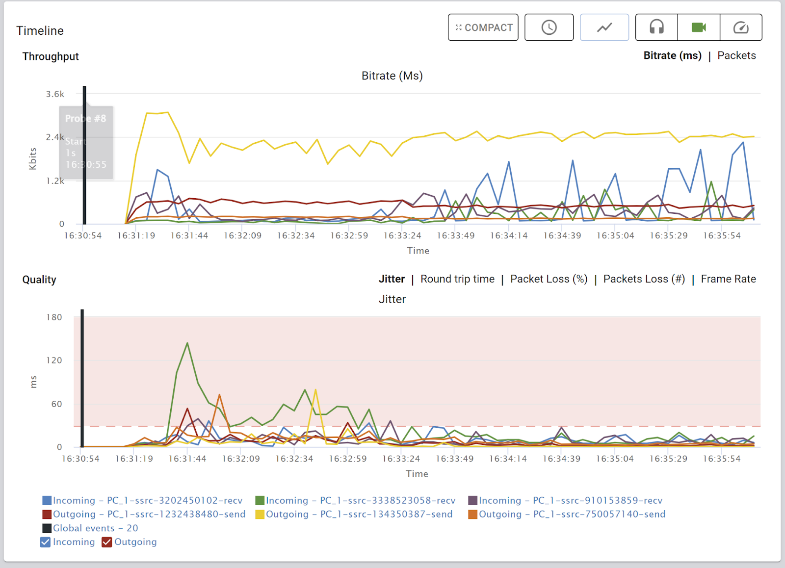
As with everything else – the point of it all is to be able to quickly figure out what went wrong.
Here’s a tidbit for you. About a year ago, we felt it might make sense to push the Timeline above the Channels section. The reasoning was that it will be nicer in screenshots of the platform – having the charts up above the fold, getting the visual part right in front of our potential buyers – first impressions and such. We tried it out, but it sucked! It just didn’t feel right with the flow that I had in my own mind when looking and analyzing test results. So we ditched it and went back. All in the name of making our visualization as useful as possible to our users.
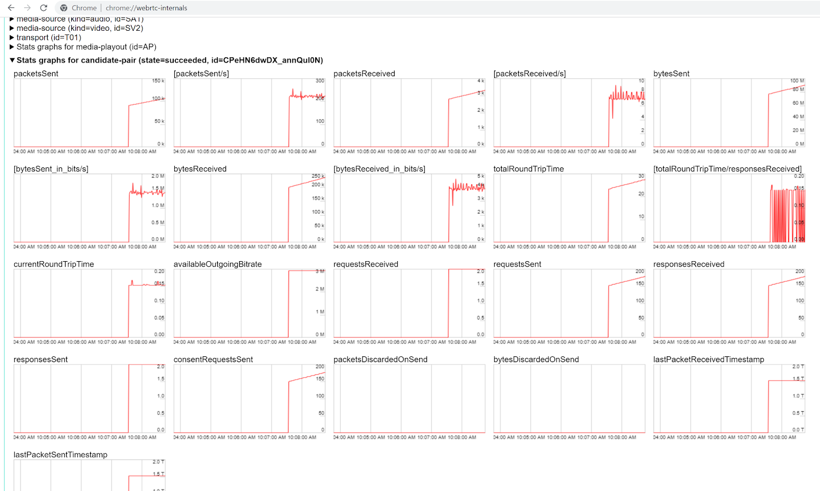
Advanced WebRTC analysis
The truth? My goal is to never need this page. The more scenarios where I don’t even need to think of using such a view the better. It is there for those who need access to the “raw” data – the experts that want to open the engine and peer inside.
What was needed here, is to turn the nasty webrtc-internals dump file below into something usable…
And we do that really well today, including separation of multiple peer connections if there are more than one. And in each and every release since we introduced this page, we’ve been improving it (and yes, there’s a big improvement on its way later this year).
Besides just being able to see the numbers and graphs, such a view shines when it comes to correlating WebRTC related data with application logic.
A few things that come to mind here:
- The ability to inject your own application specific events
- Conducting application measurements that link between custom events and WebRTC media metrics
- Correlation of console logs with the flow of a session
- Moving data points and metrics that are less important to the back (such as empty peer connections)
- Open up graphs with the most relevant metrics first
Rinse and repeat
WebRTC is ever changing and improving. Just a few months ago we had to deal with changes in WebRTC getStats that affected ALL of our analysis.
Then there are customers coming up with new requirements and needs – either because they are coming to us with new use cases which we haven’t focused on yet – or because they are looking to analyze new areas within their own applications.
We also “dog food” on our platform in many ways. And whenever a new idea comes internally, we review it and see how it fits.
All this boils down to the fact that visualizing WebRTC test results is a never ending process where we rinse and repeat, with each iteration improving what’s there for our customers to use.
Did I mention that we do all this so you can find and fix WebRTC bugs fast?
A few words about monitoring and support in WebRTC
We’ve looked at what are the main components of a WebRTC testing solution. Similarly, we can deduce the important ones to either a monitoring service or for a support tool. I’ll break it down here.
What makes up a stellar WebRTC monitoring service:
- Collection of (all) metrics related to a WebRTC application in a way that isn’t taxing on the CPU or network
- Ability to enrich with application specific data or to easily export the information collected
- Near real time analysis and visualization of the results
- Aggregative analysis and filtering from a high level
The makeup of the best WebRTC support tool you can think of:
- Conducting network and device tests to help understand the real conditions of the user
- Connectivity and quality tests to the actual WebRTC infrastructure used
- Simple scores and explanations to the end user for self service troubleshooting
WebRTC visualization in testRTC

With testRTC, we spend a lot of time on each release focusing exactly on these things. Brainstorming with the team, conducting user testing and figuring out what would be the best approach to visualize the results. My own personal goal (and vision) here is for a user to open a results page – of a test, a monitored session or a support ticket – and immediately understand if there is an issue, what the root cause is and where to go to solve it.
This is a journey that we are taking instead of a clear destination, meaning in each release we achieve yet another milestone. If you want to take this exciting journey with us, just ask for a demo.
Cyara’s award-winning CX assurance platform automates the process of discovering your IVR map so you can make improvements. It provides automated testing through its IVR testing solutions so you can ensure quality throughout the development cycle and in the live environment. To learn more about how Cyara can ensure that your IVR delivers on its promise, reach out today.